The animated sequence begins with an image of the biblical figures, 'adam' and 'eve', the tree bearing the 'forbidden fruit', is the tree of temptation, representative of the,lust in the 'desperate' lives of these women. The sly persuaisive snake in the background is the symbol of this constant tempt to give in to the enticement. The deep red background connotes love,passion and danger, which are all revolving themes explored within the series. The italic graphology looks as if it is elaborate handwritting rather than a typical computerised font. This creates the effect that it's the women confessing the story of their lives, almost like a diary entry, which is paralell with the concept of the narrator being a past character. The non-diegetic music, creates an upbeat,happy,magestic rythem, which adds a light, humerous feel to the credit sequence. The catenation of famous images that appear with the credits, are all extreemly illustrative, it starts with the 'pop up' image of The great royal wife of the Egyptian pharaoh Ramses the Great. Her name means 'beautiful companion' and is known for her lavesh toomb and lifestyle shows her as acquisitive lifestyle. This leads on to a famous painting of a man throwing a banana and at pregnent women who has to clean it up with a broom (Material wealth by jan van eyck), which uses bright powerfull colours to present opulence and self glorification. The next image is of a couple stood outside a typical suburban Amercican home 'American gothic' and is a satire of the narrow mindedness of small town life, mocking the idea that nothing would happen do these average women living 'dull lives'. An American 'pun-up' pops up inront of the couple, and attempts to claw at the man, suggestive of the auldery, lies and allurement, and the way the women is then locked away in the sardiene tin shows the dull domestisity of dated life, this is shown through the dull, grey colours that are apparent in most of the starting images which are then replaced by blinding, harsh, exuberant colours that appear in the 'Am I proud' propaganda poster, and the "romantic couple" representing the balance and struggles of the modern day women, and the pop art arguing couple, where the women punches the man, shows the power of this liberated women. The four key characters appear at the end, with high key lighting showing them in a postive and happy depicition, the apples they hold in their hands are represetning the seduction that they have clearly given in to, which is in line with their sly, lusterious expressions and provcative attire.
Monday, 30 January 2012
Sunday, 29 January 2012
Filming Schedule

Friday, 27 January 2012
Week 2 - planning our cast and locations
Group meeting - 2
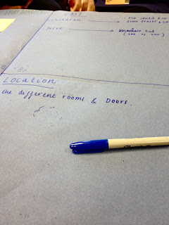
In week two we looked back over our notes and ideas and started to realistically decide what was achievable, and what we would need to plan in order to create a high quality thriller film. We started to think about casting, discussing firstly what we wanted our characters to be like or look like and then secondly we considered what contacts we actually had. Our chosen plot like was based antically around the story of a pedophile and a teenage girl. The idea was to create a piece that hinted at quite brutal issues, but did so it an appropriate and subtle way, because of this we decided to cast girls from between the ages of 12-16 rather than opting for younger actresses, we also chose to use people that we knew, because we felt they'd be able to play the tricky roles in a more natural and relaxed way. We didn't want 'stiff acting,' or for the actor to feel uncomfortable and therefore that awkwardness consequently shine through in our film. We also started to think about available, interesting locations that would run parallel with our storyline.
Thursday, 19 January 2012
Week 1 - Planning and storyboarding for our Foundation Task
storyboarding

planning ideas


Group meeting - 1
Here I have enclosed some photographs of our first group meeting in which we planned our foundation project. We started by brainstorming, writing down the different film genres and then cutting them down to the ones we felt we could possibly develop an interesting story around. After narrowing down our options, we finally selected thriller as our genre, and begin to throw around lots of different sketchy stories we could maybe adapt to make our opening sequence. later after developed those suggestions, we fitted together the different ideas into a more a structural plot line, giving us a good indication of what we would need to include later on, on a story board.
Friday, 13 January 2012
Initial response to brief
Our brief was to create an opening sequence for our own film. We needed to be able to incorporate all of the techniques that we have learnt so far on the course, and experiment with a wide range of shots, creative titles, and seamless and/or inventive editing in order to develop a piece of work with high quality. Our task was to select a film genre, may be it : horror, science fiction, action/adventure,gangster/crime,romantic comedy, thriller and so on. We decided on thriller, simply because we wanted to pick a genre in which we could capture a wide range of interest shots, and create a sense of enigma and tension throughout, and believed these aspects that are key conventions of thriller films, would be ones that would make our film much more original and interesting, in order to hold our audiences full attention, and leave them feeling unnerved and eager to know more. We did consider horror but believed that on a 'low budget' production, we would not be able to convey the true depth that a horror film has to depict, and believed that if we tried to recreate a horrific opening, that we may not be able to scare our audience enough for it to be a successful sequence. We also considered doing a romantic comedy, but we believed that unless we found actors of an extremely high ability, that we would struggle to capture a realistic relationship, and we wanted to be able to make a film that displayed work to the best of our ability. I was really excited when I heard what our brief was and in our first brainstorm our sheet was spilling with ideas,suggestions, and illustrations, of what sort of things our film could include, our overly keen approach, allowed us to have a mountain of ideas to which we selected the best and condensed them together to create the basic story line of something we thought could have great potential.
Thursday, 12 January 2012
Response to group choice
After selecting our genre of Thriller and all brainstorming ideas of what kind of themes we could incorporate and which of our suggestions would be best to be put forward and used for our final storyline. We selected one idea, and then fed of this, all contributing to our basic concept,and building it up to be something that was a lot more inventive and creative. Someone would come up with something new to trump the old suggestion and suddenly ideas were fitting together perfectly, and everything started to become much more real and considerably more original. We wanted to make our film quite creepy, and bewildering, drawing on sensitive themes and disturbing issues, that would make our audience feel uncomfortable but at the same time enjoy our work. We decided to base our piece around a man who has a past blotted with conspiracy, we wanted to create an effect that would make our audience feel connected to our main victim and decided we wanted to incorporate the use of flash backing to another key characters suspiciously dark and frightening past.Once everything was fixed, we then started to plan or visual aids like costume and makeup, our locations, or actors, and ideas of what shots we were going to incorporate, these messy scribbles soon turned into a storyboard in which our thriller was starting to come together.
Legally Blonde - opening sequence
The story line is introduced by a montage, this is used to compress time, as it shows a journey in about three minutes, that would take a great deal longer in real life. It is also used to build up an idea of the key themes that will run fluently throughout the rest of the film, and help us Gage a clear idea of the main character. Different signifiers give away hints at this key characters personality, for example the sign saying homecoming queen, or the bright pink hairbrush, which both help to develop this feminine, girlie character. The title's and font used for them are written in a style representative of handwriting, the swirly, pink graphology is complemented by the parallel sound track, playing a song called 'perfect day' enabling the audience to establish the hook in the sequence, supported by a phone conversation where the key characters says "love you warner", both of these indicate that later on something will most probably come along to ruin this 'perfect' atmosphere, and it will most likely be in relation to "warner" and a love type storyline expected as a convention of this genre.The non-diegetic upbeat music, along with the high key, bright, warm, hopeful lighting develops the typical feel of the chick flick genre. The key characters introduced (explored through the invisible montage and the use of tracking and cross cutting to show that 'Elle' is the protagonist) help to establish a modern American university setting, with the key character being your typical, pretty, blond, 'perfect' queen b. The focal colour of pink, is presented through the mis en scene, in her costume, makeup, and surroundings :the pink nail vanish, outfit, bedroom, everything is fluffy and overly sickly 'pink', exaggerating this ditzy blond persona, and attitudes dependent on looks and material happiness.
Wednesday, 11 January 2012
'The Promise' - Episode 1 - Opening sequence

The credits appear on a black screen before we actually view any
of the action itself. However we can hear the background noise of
whatever is happening within the clip, a merge of footsteps, cluttering people,
trollies being pushed, general chatter, and bustle. 'Channel four' 'Canal and Arte France' and 'Daybreak pictures' are given before any introduction to cast names, these titles appear one after another, with representative graphological features, the white, then change to blue and fading effect, presenting innocence and vulnerability, and the other masculinity or alternatively sadness, fear and pain. The dark screen flips to show two women, (who appear moody and upset) walking down a hospital corridor, towards the camera as it reverses back and then flips onto the credit sequence once more. (credits convention one applies here) This creates an increased sense of enigma throughout, only viewing small snips of the action we automatically want to know more, see the whole picture, and
the withheld information. we're left asking, who are these women? where are these women? and what are they doing here? When the action is playing once again the camera jumps to a reverse angle shot and we see them walking from behind, only at this point do we here somebody speak for the first time. A question is posed, again creating even more suspense and enigma, but also establishing
that the building they are in is intact a hospital, which is then supported by some hospital staff walking past, and features of this location become more easily connectable. The costume here, and the interior help to suggest that it is set in a modern day, 21st century context. The action is all seamless, and the continuity editing creates a smooth effect, and naturalistic feel. Relationships are additionally established during the opening, we find out, (through dialogue, proximity, and interaction) that the two women are mother and daughter and they are visiting the mothers, father who is ill in hospital. We also find out they are not very close with one another, which is also reflected in the grey, dull lighting which creates a cold and uncomfortable environment. The camerawork reveals a lot as well, the extreme close ups of the old mans face, the establishing shots of certain objects, and the reaction shots, which all help to build up an indication at possible themes that could be explored, in the rest of the footage. The continuous bridging of sound throughout gives it a realistic feel, however this is broken by diegetic orchestral music, which runs parallel to the content of the action. When the action fades at the end of the sequence, this effect creates a sense that he has either passed or alternatively that we will be transported elsewhere, shifted in time, or that we are entering his mind or memories.
Skins series 1 - opening

Opening sequences
Skins series 1 – episode 1
The programme begins with a montage of different clips and images, used to build up an idea for the audiance of what kind of content the episode /series is going to include. It also gives the audience an idea or ‘sneak preview’ at the kind of characters who make up the show.
The rough guideline of the storyline is aided by a happy, upbeat, repetetive peice of music, which is non diegetic. The music is partly parallel – when the montage displays the characters enjoying their youth, partying,having fun and taking part in social events; but ,on the other hand is contrapuntal when the images depict the underlining sadness of the series and gives a hint towards the major issue’s these adolesence have to deal with in their lives.
The montage is not seemless at all and is very obviously edited together. The Fade effect is frequently used to overlap the different images, perhaps to show how continuously busy their lives are, filled with constant changes and a mass of ‘overlaping’ issues, one on top of another. Cartoon like effects are also added over the clips, for example : cartoon smoke from a cigerette, or a bird flying away out of the shot, both of these could be a clear representation of rebelion, freedom, and the seeking of independence. Some of the clips in the montage are not of the characters at all, but additionally help to tie together a feel for the show, and the ‘teen drama’ genre. The photo’s display objects such as, cans of alcahol or road signs, once more creating the feel that these teenages have a lack of boundries and dicaplin, and are lost or searching for themseleves and their identities. More images are used to establish and help set the location; with, flats, houses, rivers, bridges, parks etc, showing the audience that ‘Skins’ is set in and around a city.
The title of the show doesn’t appear untill after the montage has ended. It flows in and the text jumps between being large and small, untill it settles on a black screen, where through the word skins, an image of a river can be seen. It then starts with an extreem close up shot of ‘Tony’ – a key character, the camera then moves away from his face, accumponied by the sound of church bells. Moving into a long shot, we can see his whole room, helping to show the context (that it’s 21st century) and also helping to build up Tony’s character. The dovet cover for a start is an anicial indicator of the types of topics explored within ‘Skins’ (teen sex and relationships), it has a naked man and women on the front of it, and gives of the idea that Tony is maybe quite a bold, overly confident, flirtaious,shameless boy, this image is in complete contrast to the sound being played, feasibly hinting at the idea that he may have different sides to his character, or may put up certain personas to others. Paralell music then cut’s in, and a rap song takes over from the placid music, a seemless string of clips of him in his room – doing press ups, weights and looking in the mirror approvingly all idicate that he is quite a vain and self absorbed character. Once more looking at the mis en scene, the fact he spends the entire scene in boxers is another sign of body confidence and arragance.
The lighting used is quite dull and naturalistic, reflecting the realism of suburban life. Enigma is created when the shot flips to the street outside – establishing the area, a scruffy looking character, in punk type attire (holey skirt, fish nets, revealing top) is linked to ‘Tony’ by a sound bridge where a phone can be heard ringing from outside and then when it reverses back to Tony’s room, can still be heard, allowing the audience to know that the two characters are somewhat connected but leaving them to guess why.
Tuesday, 10 January 2012
Preliminary project
Our preliminary project was titled 'feed the fish', and was a short flm. We wanted to take this task header as a metaphor, and have the 'fish' as a code word for somebody who the two key characters within the clip, were being opressive towards, and holding captive. We wanted to use a wide range of shots and create an interesting variety, aided by smooth continuinty editing. I think we achieved this goal, for some of our shots for instance : the high angle shot of a photograph being slammed onto the table and passed over to the second in command, the photograph was of a small child and gave an insight into the idea that these two characters are involved in dodgy affairs relating to kidnapping and child abuse, the photo was circled and labeled clearly, in red the word 'victim' - used to connote danger and horror. The shot created the idea that they had an enourmous amount of power and status over their victim, and the focus purely on this 'new task' and not the other two characters, depicted that their relationship purley revolved around 'work' and immoral activities. I think we created a seemless eiditing effect when we flipped between the two characters sat at the desk, we initially filmed both characters reading their entire script on two seperate shots and then fitted them together after filming. However certain elements that we didn't ulter created an unrelistic effect, for instance the eye contact wasn't coherent and certain objects could be seen that were not meant to be, for example the 'victim photograph' could be spotted before it had even been handed out yet. My favourite part of our film, was the flash back, giving an indication at what we truely meant by 'feed the fish', we edited this to make it black and white, creating the sense it was in the past. Overall I was disapointed that during the interveiw, we didn't use a greater range of shots, which would have made it alot more interesting and dynamic effect.
Subscribe to:
Posts (Atom)